PowerPoint
PowerPoint can be an amazing aid in your oral presentations if you use if effectively. Unfortunately, this is extremely difficult to do. One of the biggest complaints from lecturers is students' use (or more accurately, misuse) of PowerPoint. Be particularly careful with your PowerPoint slides. Some of the tips below will help you to use PowerPoint more effectively.
DO NOT put your script on PowerPoint. Be aware of the power of visual text. Your audience will be too busy reading your slides to pay attention to what you have to say. |
You should use “dot points” on your slides, unless your lecturer has specifically stated otherwise. This process of preparing your slides should also help you distil your presentation into key points. |
Try to synthesise your ideas so that you can talk to your key points. They can act as an anchor in your audience members' minds. It is never a good idea to read the points on your slide word for word. |
PowerPoint is at its most valuable to students when graphics are required. |
It is often too easy to 'cut and paste' your information from a preexisting electronic document. You are actually required to understand and analyse the material that you have collected. It is also expected that you will make some conclusions of your own. But, most importantly, the material should be put into your own words. Plagiarism is just as big an enemy in an oral presentation as it is in a research paper. |
Make sure you spell check and carefully proof read your slides. There is nothing worse than everyone in the room knowing that you cannot spell key terms and names correctly. |
Try to reserve one major idea for each slide. |
As a general rule of thumb, you could strive for one good slide per minute. Realistically, you will need at least a full minute to develop an idea properly. People need time to absorb your ideas or to reflect on graphics that you present to them. Do not race through your slides too quickly. |
Be aware of your surroundings. Lecture rooms very rarely have the capacity to be fully darkened. This means that for your slides to be read, you should have clear contrasts in your text so that your writing may be read under any light conditions. |
If you get a chance, do a test run of your slides on the computer that you will be using on the day. Make sure you can read everything from the back of the room. |
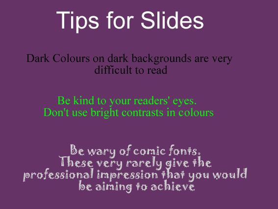
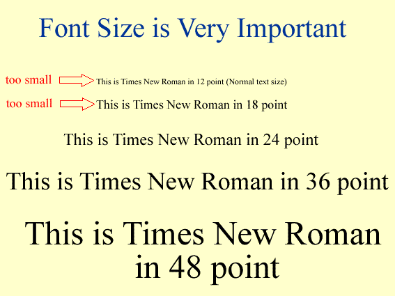
PowerPoint design is important, but it should not be considered to be the most important aspect of a presentation. [Flashy PowerPoint slides will not make up for a lack of genuine content and deep thought]. Some of the biggest design mistakes that students make include choosing colours that are difficult to read (see Example 1), choosing unusual fonts that make the presentation look unprofessional (see Example 1), and choosing inappropriate font sizes that are too hard for the audience to read (see Example 2). |
Don't be seduced by the dark side of PowerPoint. If you spend too much time adding features such as animation, unrelated sound effects, clip art, and flying letters, you may end up making your presentation appear frivolous and, in turn, ruining the effectiveness of your presentation. |
Don't use PowerPoint for the sake of using PowerPoing. Make it work for you. |
Be wary of using templates to start you off. You may unwittingly create a presentation which does not allow for deep or complex thinking. You need to make the design and layout of your slides suitable to the depth of analysis that you are attempting to portray. |
Don't leave images or text up on the screen for longer than is absolutely necessary otherwise your audience will be distracted from the other important points that you are making. A worthwhile PowerPoint trick is to press the B key to make the screen go black or press the W key to make it turn white. In this way you control when the audience is to look at the screen and when they must look at you. |
Example 1: Design Problems for PowerPoint Slides

Example 2: Font Problems for PowerPoint Slides


